Kitchen Colour Trends 2025: Palettes for Timeless, Light-Filled Kitchens
Colour sets the mood, and in the kitchen it must also play nicely with light, texture and everyday wear. Here’s how to choose on-trend, long-lasting palettes that feel refined and easy to live with. Eco Squared designs, supplies and installs European-style cabinetry across the Sutherland Shire & surrounds, from Como and Oyster Bay to Woolooware and Bangor, pairing beautiful finishes with practical, low-maintenance details.

What’s trending in 2025
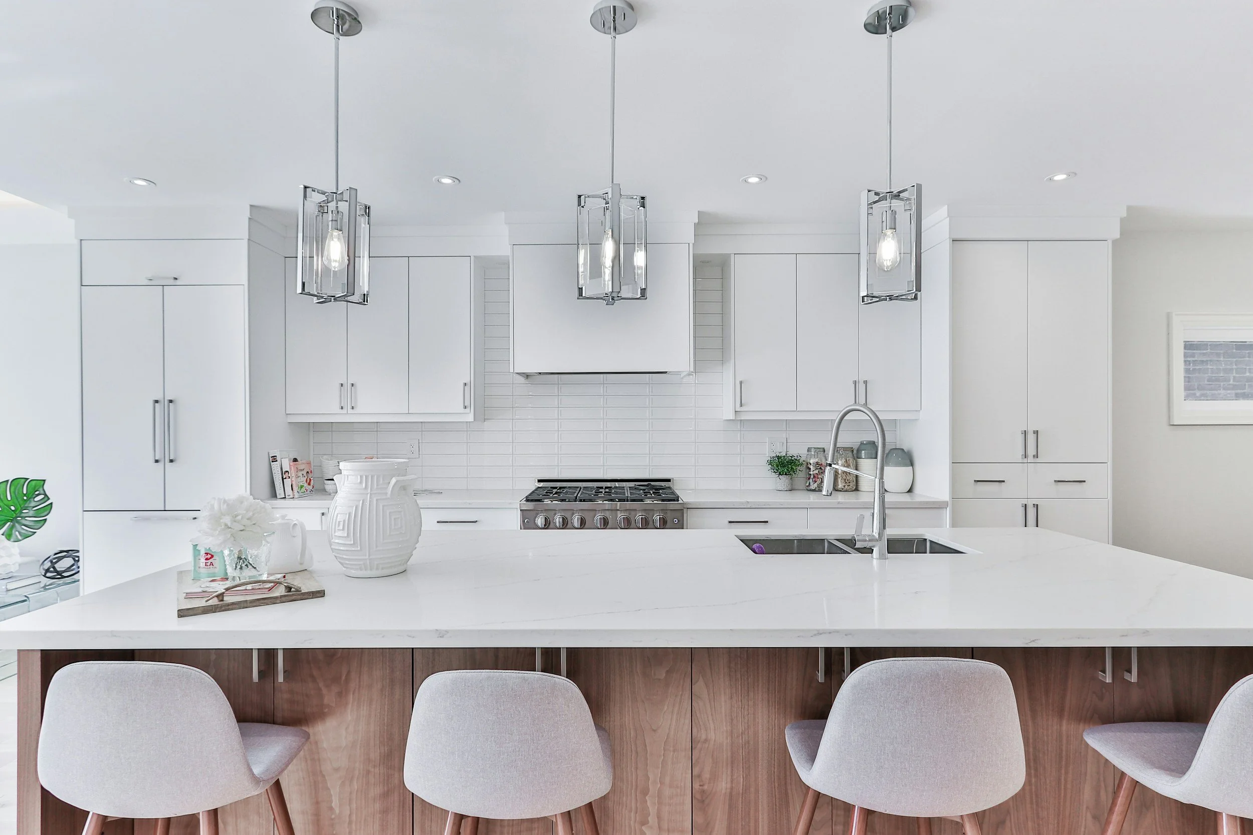
Warm whites & soft greiges
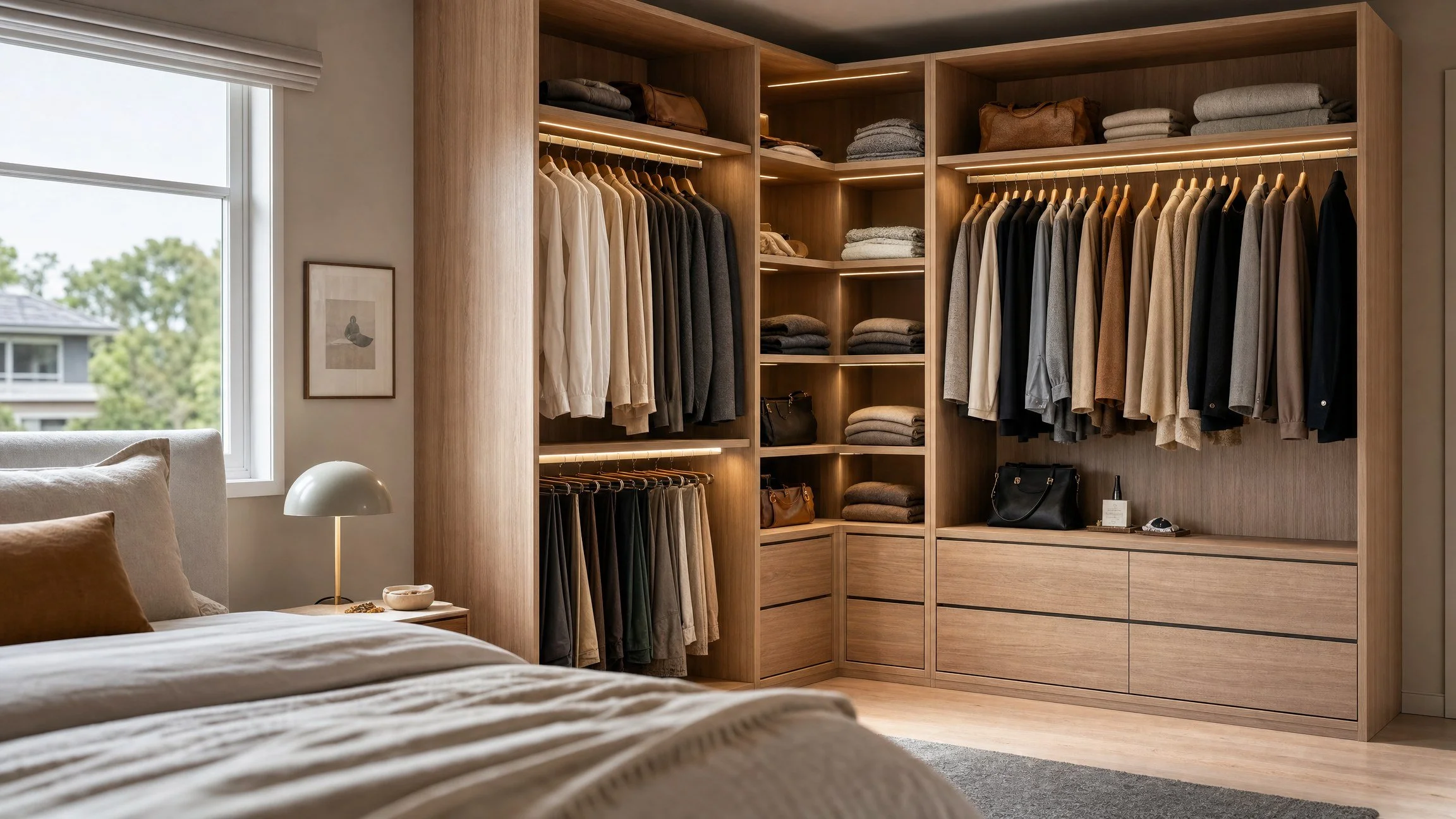
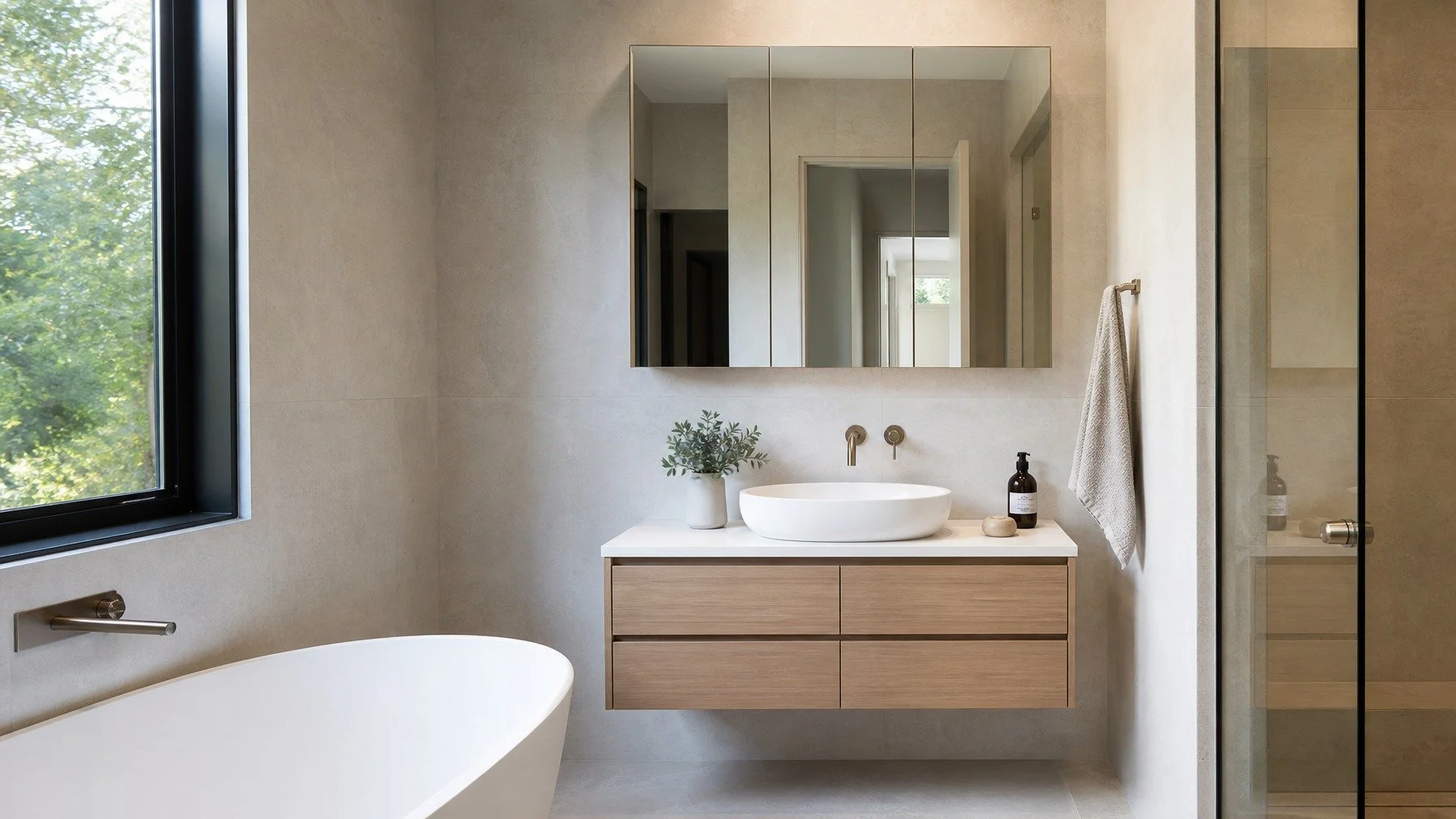
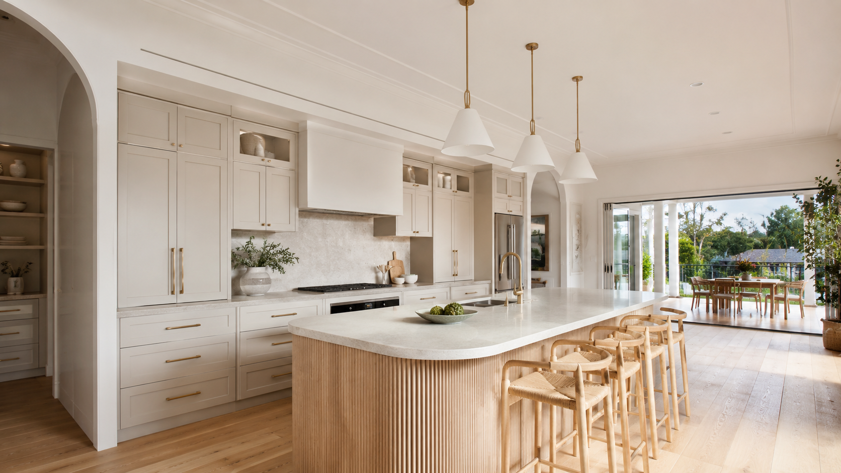
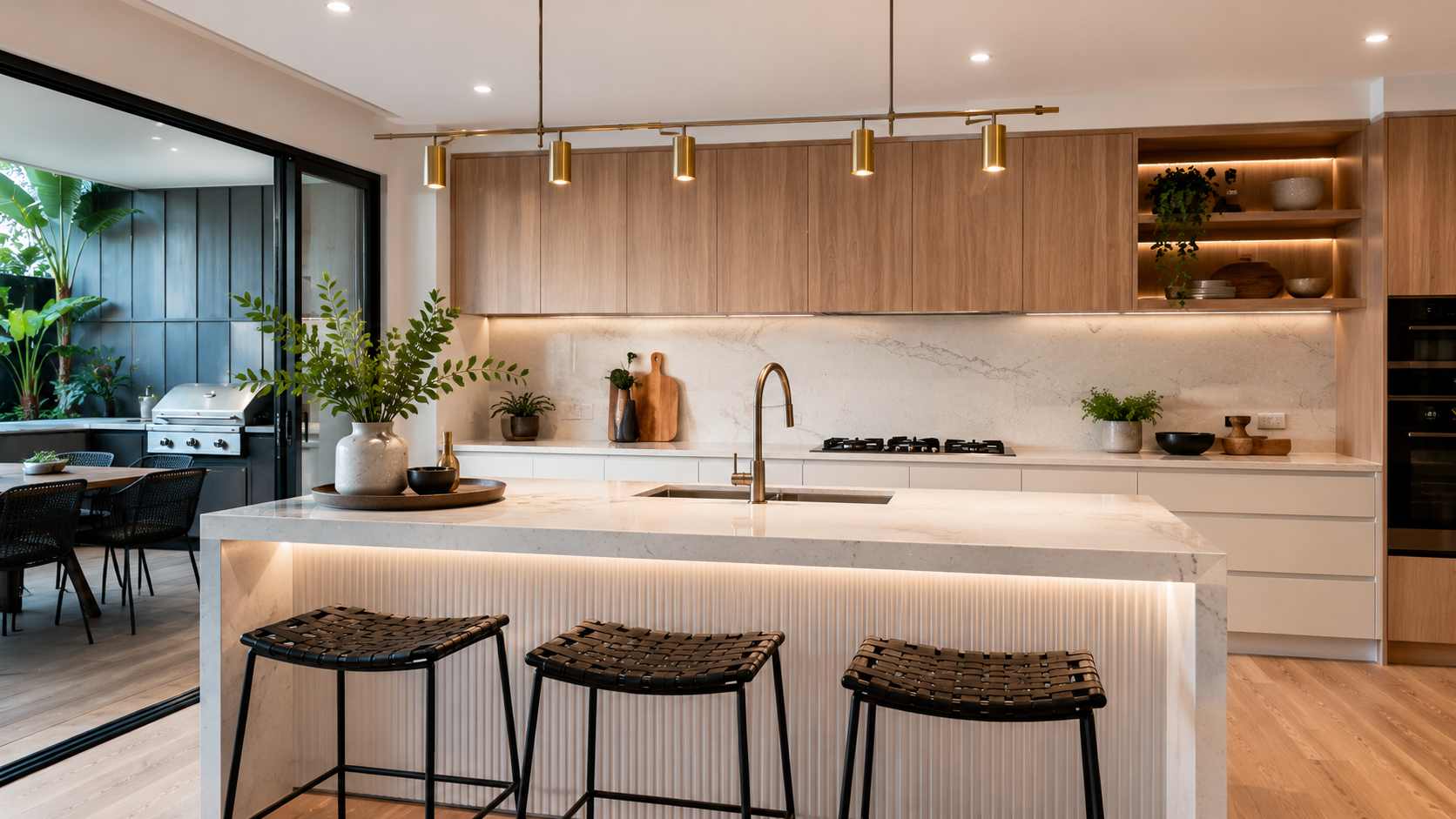
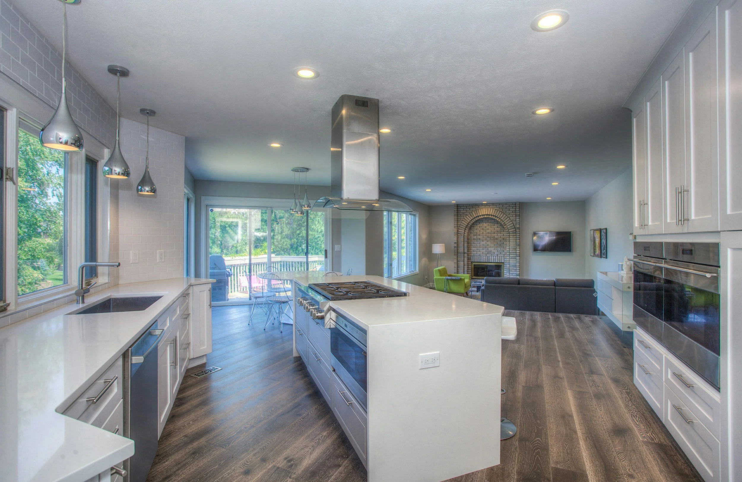
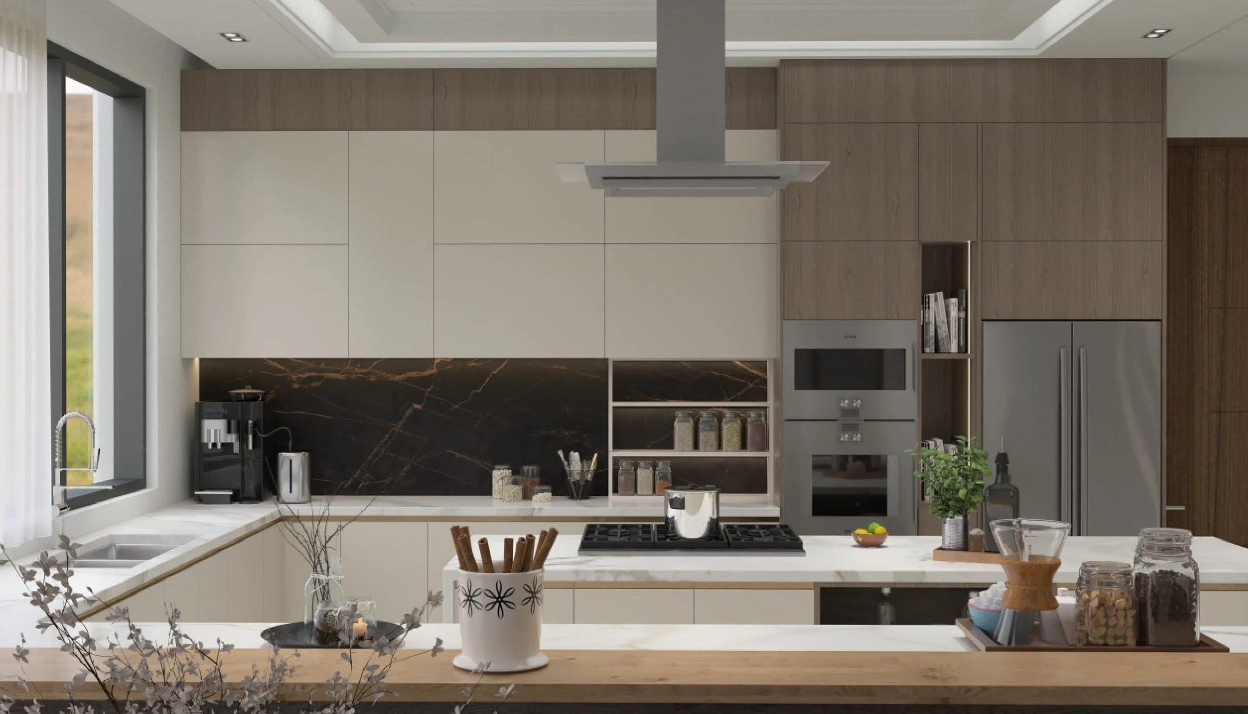
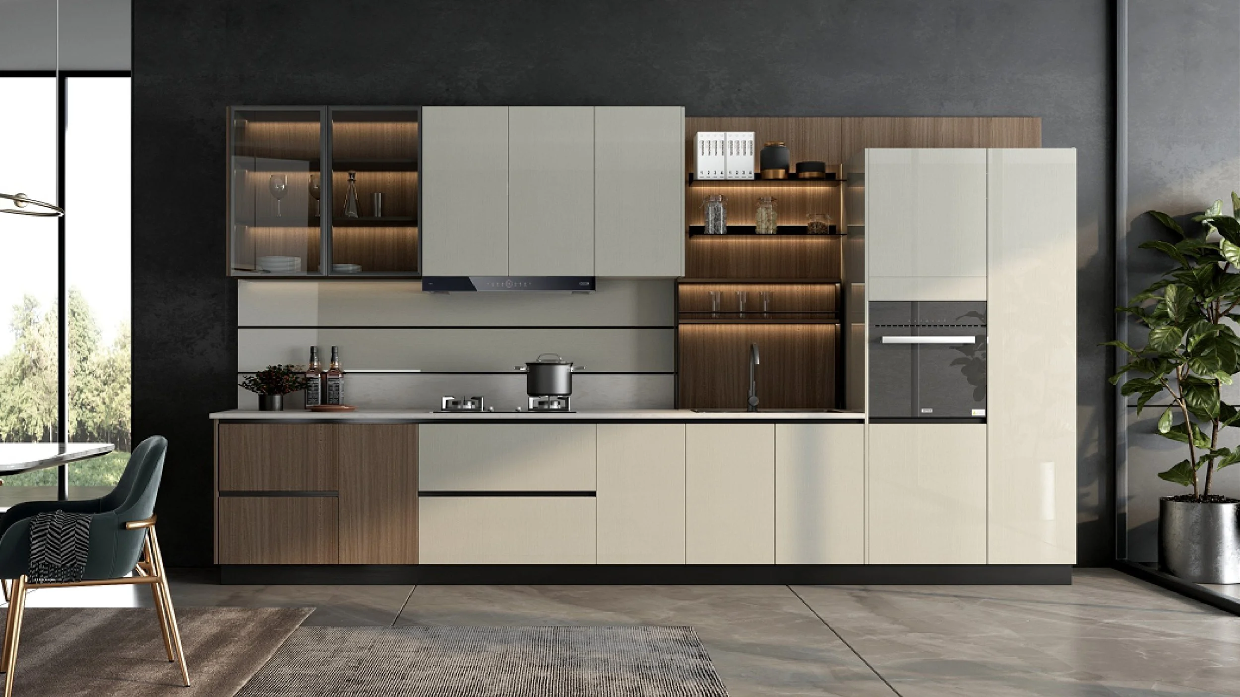
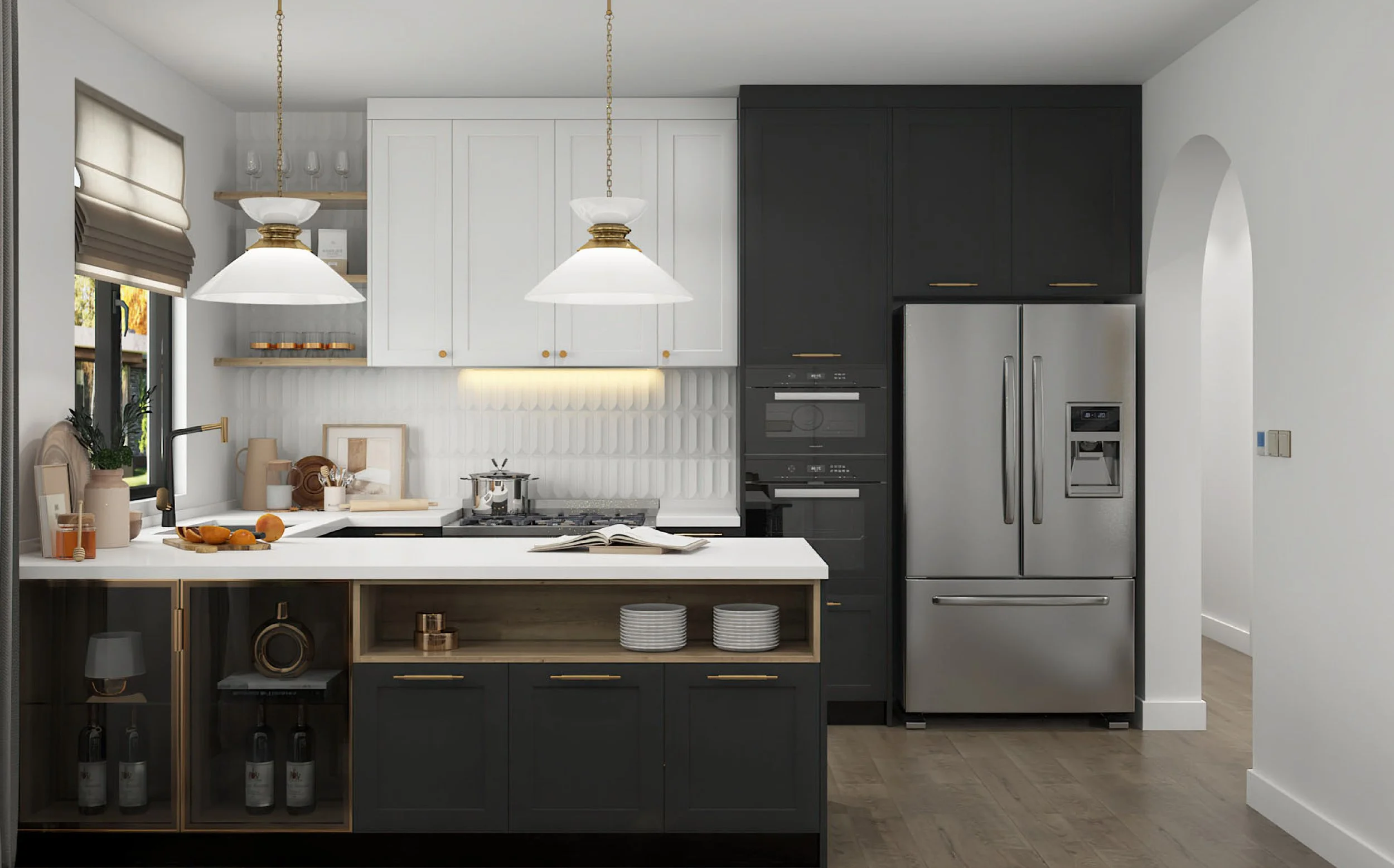
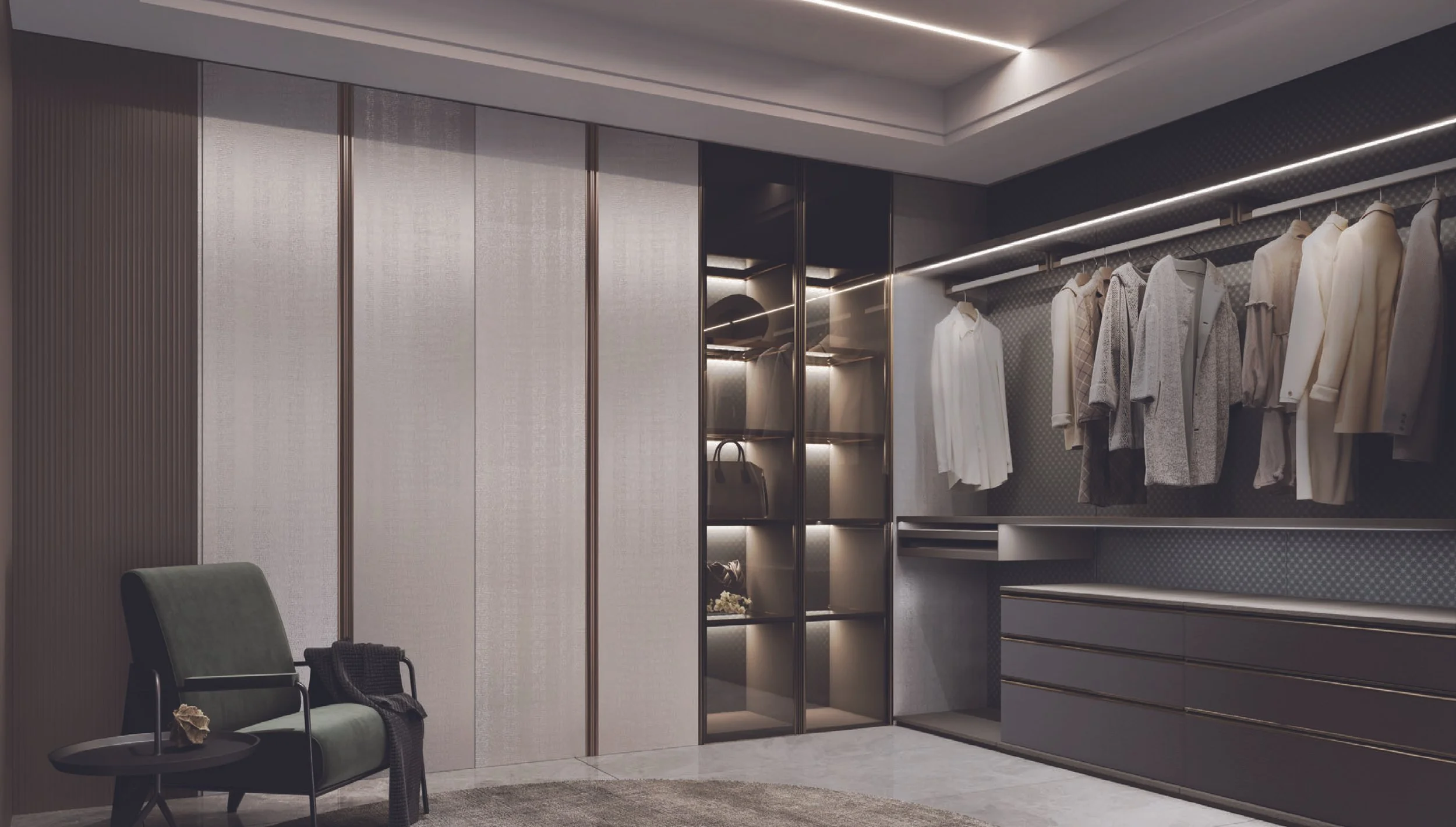
Cream-based whites and gentle greiges are overtaking stark, cool whites. They flatter timber tones and stone veining and look calm in open-plan homes.Light oak & mid-walnut woodgrains
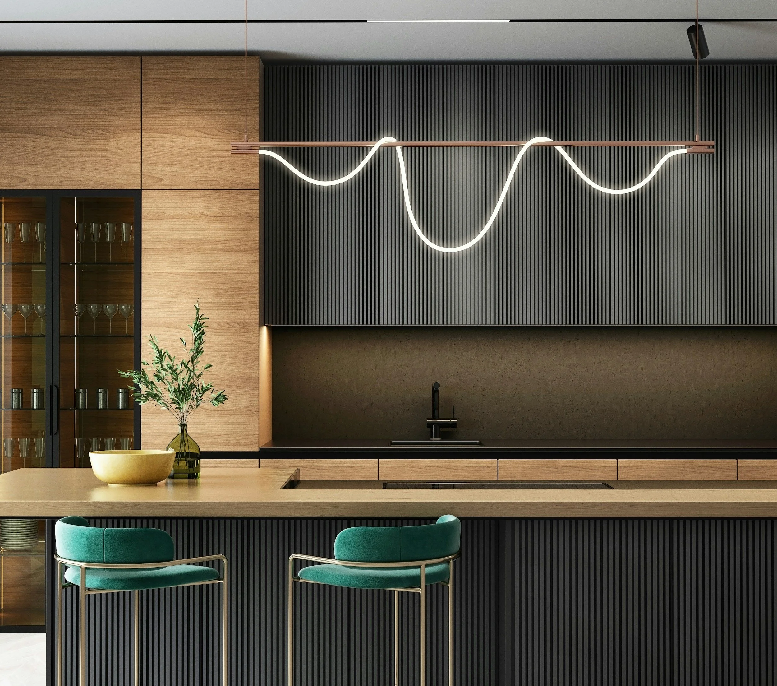
Natural timber (or wood-look laminates) adds warmth and texture, especially on islands or tall units.Muted greens & powdery blues
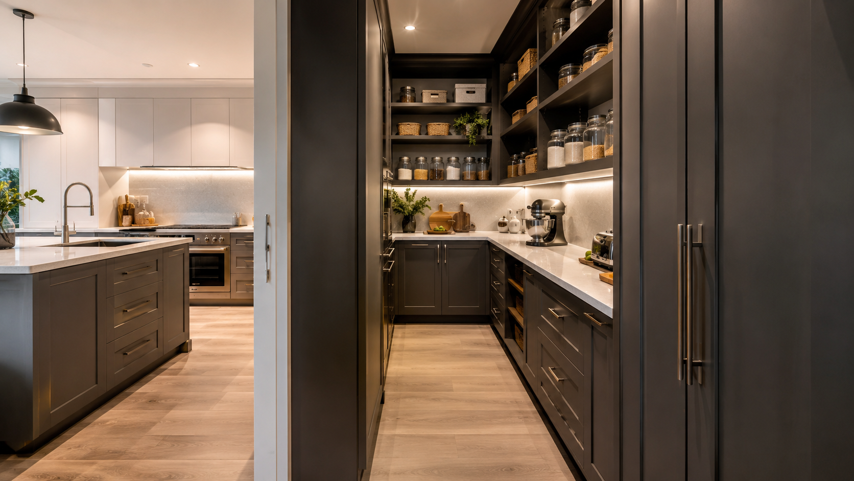
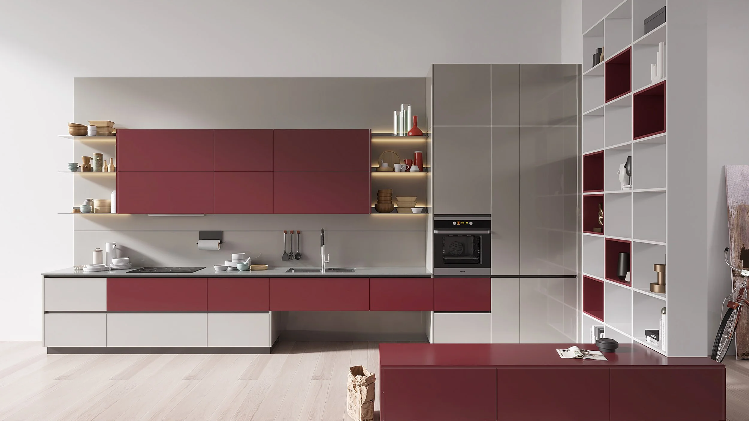
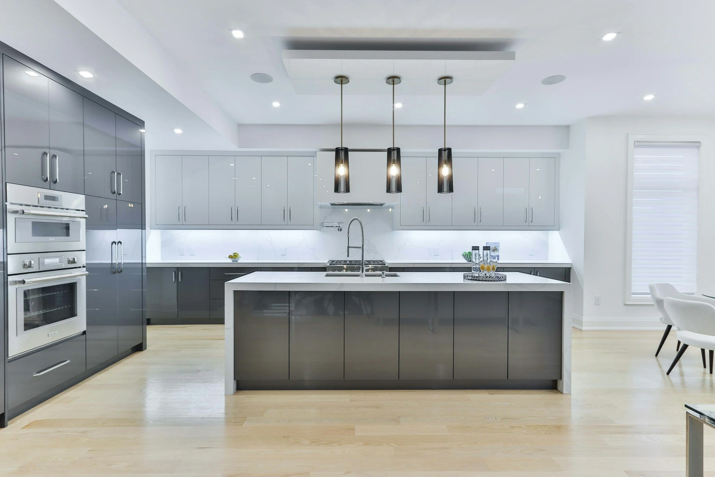
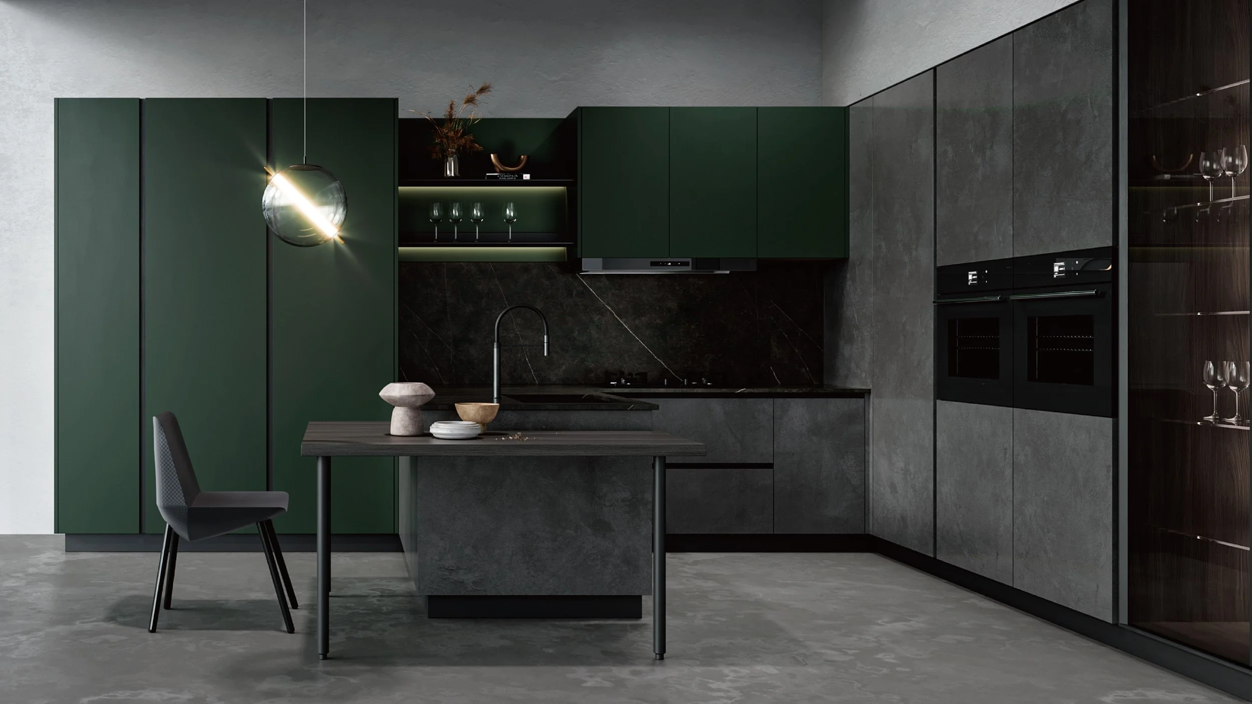
Dusty eucalyptus, sage and inky-midnight blues deliver colour without overwhelm - gorgeous against brass or aged bronze hardware.Matte black as an accent
Use sparingly on handles, tapware or the rangehood line to ground lighter schemes.Stone-look porcelain/sintered surfaces
Subtle veining in off-whites, sand and taupe gives depth without busy patterns.Mixed warm metals
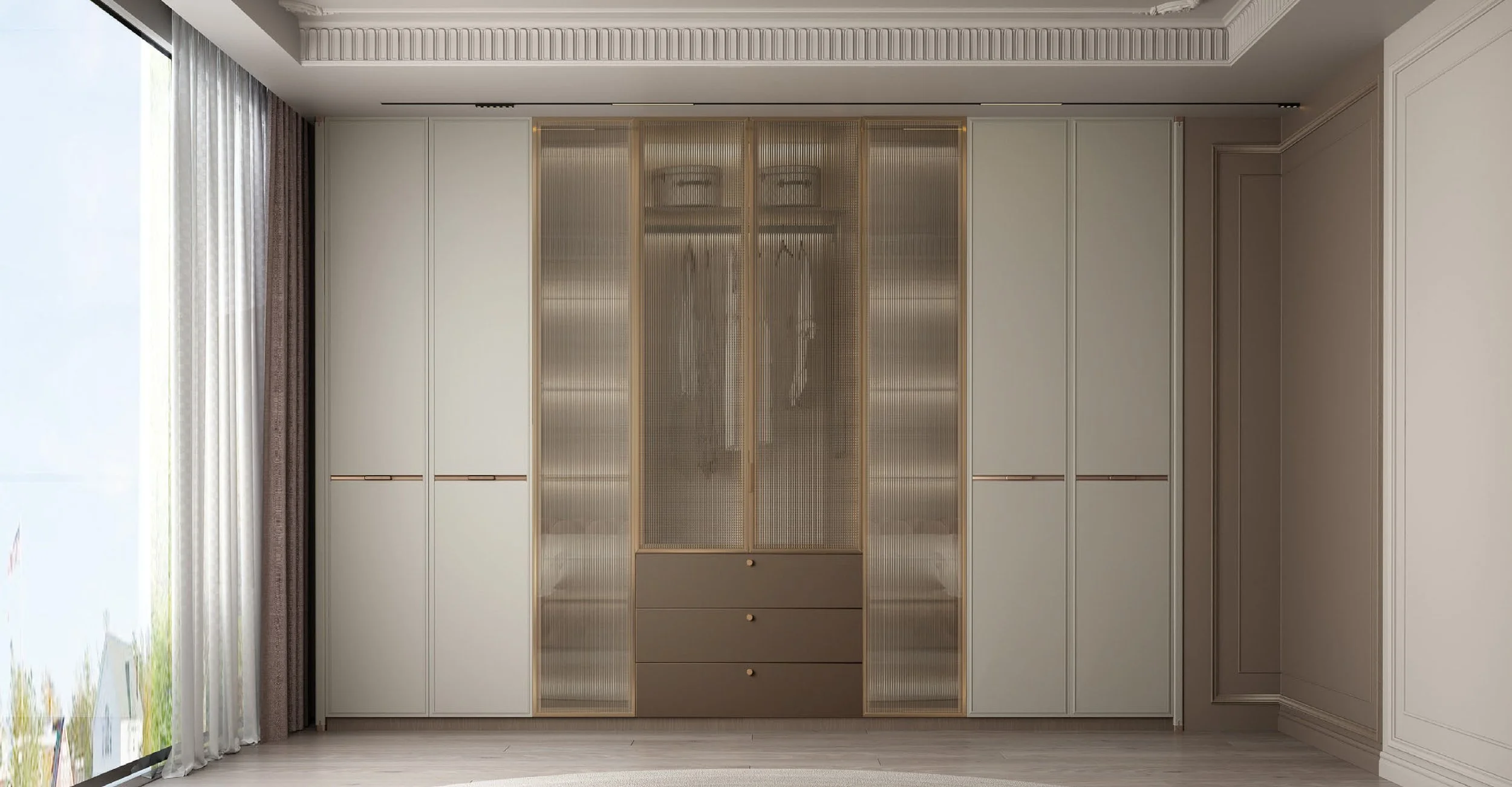
Brushed brass, bronze and champagne nickel read luxurious - keep one dominant metal and one supporting tone.
How to pick colours that last
Match your light
North-facing rooms handle deeper hues; south-facing benefit from warm whites and pale timber. Always sample at full height and view morning–evening.Check undertones
Pair warm whites with warm stones/woods; cool whites with grey-veined stones and cooler metals. Avoid clashing pink-vs-green undertones.Think beyond the kitchen
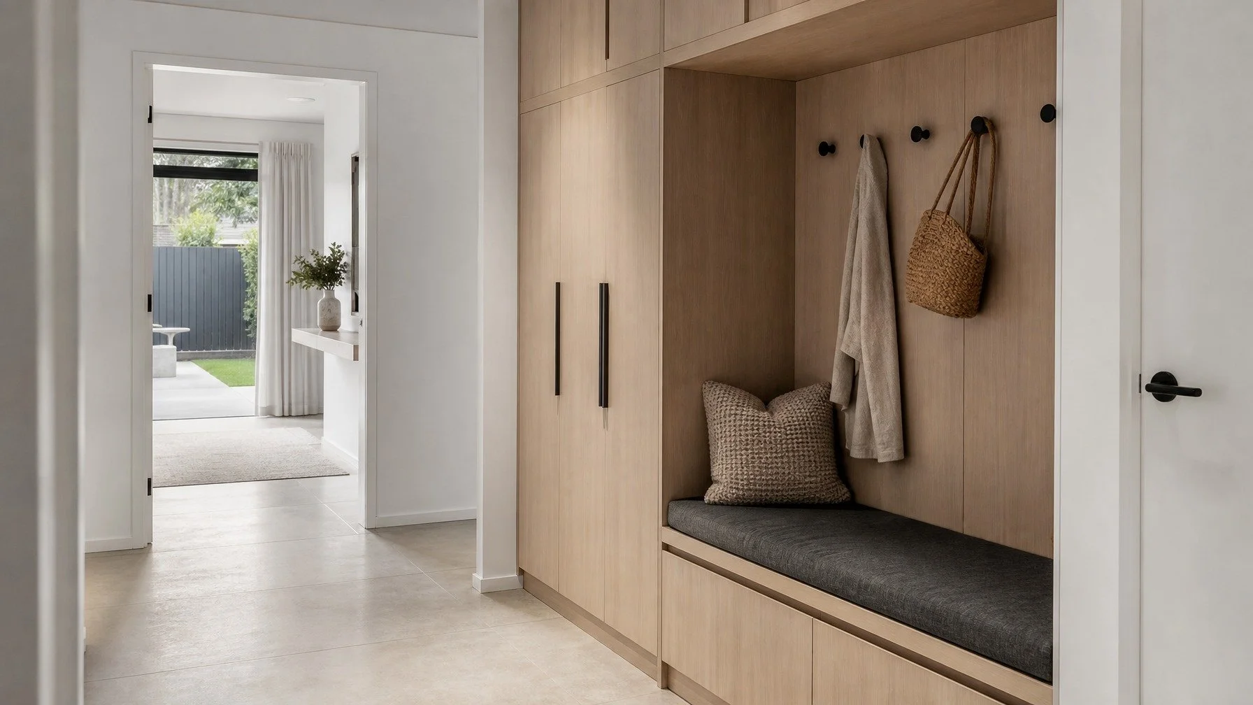
Run your palette through adjacent spaces (entry, living, dining) for a cohesive whole-home feel.
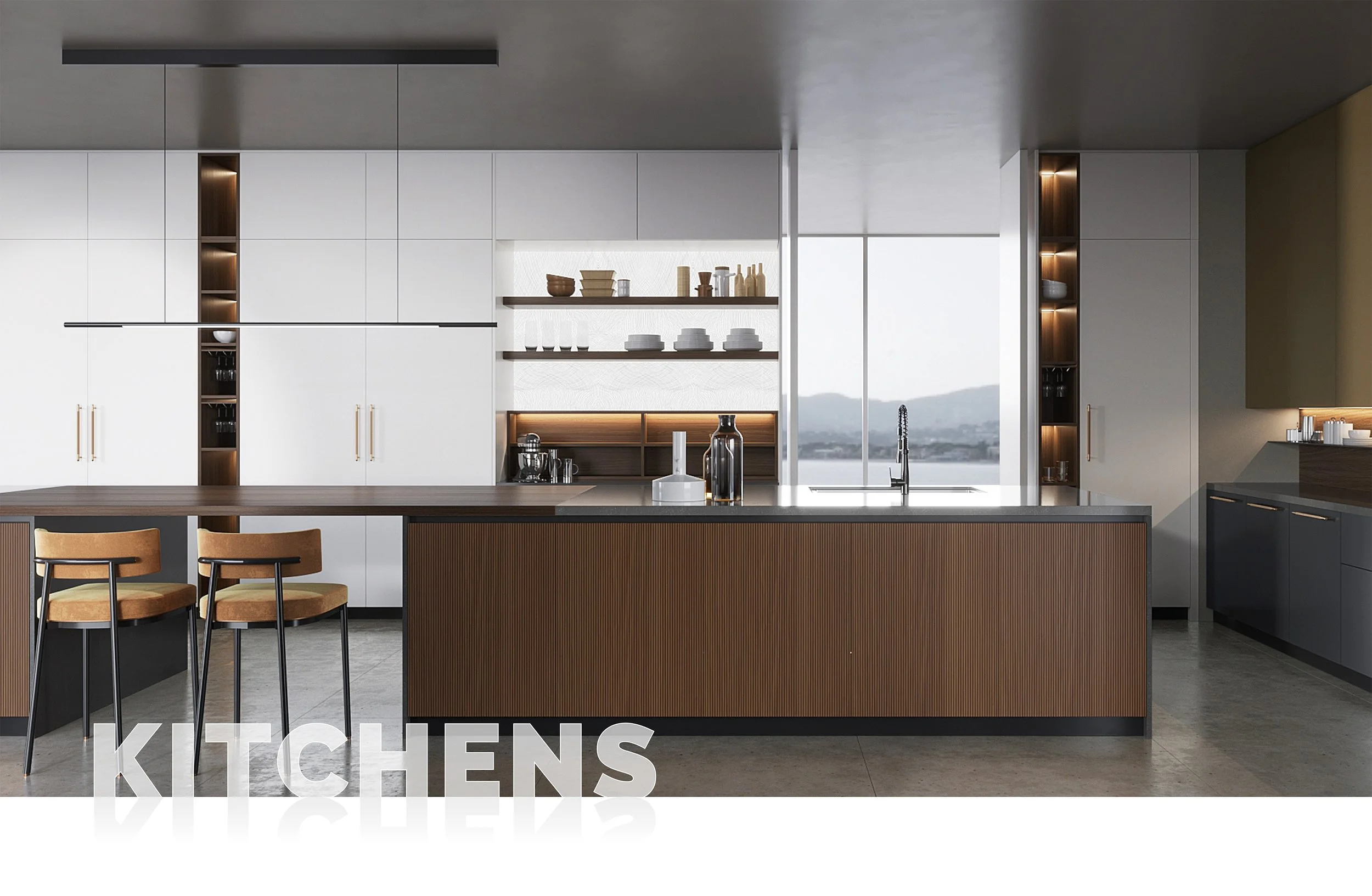
Two-tone cabinetry that feels designed (not busy)
60/30/10 rule: 60% main cabinetry, 30% secondary (island or tall units), 10% accent (open shelves, back panels, handles).
Light up top, darker below: keeps sightlines open and benches grounded.
Hero the island: a mid-walnut or muted green island against warm-white perimeter units looks premium without shouting.
Finish matters: matte, satin or gloss?
Super-matte / anti-fingerprint
Soft, modern and practical on base units and large spans.Satin / low sheen lacquer
A touch more light bounce; elegant on Shaker or subtly framed profiles.High gloss
Best as a deliberate accent or in very small spaces where you want strong reflection - pair with quieter surrounds.
Benchtop + splashback + cabinetry: fool-proof combos
Warm white matte cabinetry + light-vein porcelain + brass → airy and timeless.
Muted eucalyptus base units + warm white overheads + walnut island panel → soft colour with natural depth.
Mid-walnut cabinetry + off-white stone + matte black accents → modern, luxurious contrast.
Powdery blue island + greige perimeter + glass or slab splashback → coastal sophistication.
Small kitchens: colour that enlarges
Keep to tone-on-tone: warm whites/greiges with timber accents.
Choose large-format slab or glass splashbacks to minimise grout lines.
Use under-cabinet LEDs to reveal texture and keep benches bright.
Reserve strong colour for the island or a single tall block, not every surface.
Hardware, walls & flooring (the quiet anchors)
Pick one primary metal for tapware/handles; let lighting carry the secondary tone.
Walls: soft warm whites that match cabinetry undertones; avoid optic-bright paints.
Floors: keep grain direction running with the room length; medium-toned timber or stone-look porcelain hides daily wear elegantly.
Good / Better / Best palette paths
Good: Warm-white perimeter, light-vein porcelain top, brass handles, glass splashback.
Better: Add muted green island, timber open shelves, satin walls, layered lighting.
Best: Warm-white + walnut two-tone, veined porcelain waterfall island, book-matched slab splashback, champagne nickel lighting, anti-fingerprint fronts.
Common mistakes (and easy fixes)
Too many heroes: pick one - island, splashback or tall bank, and keep the rest supportive.
Clashing undertones: sample together under your actual lighting.
Busy patterns + busy grain: choose either bold stone or prominent timber, not both on large areas.
Transform Your Space with Eco Squared
Embrace the elegance and functionality of European design with Eco Squared. Our Oppolia partnership provides access to premium materials and cutting-edge manufacturing, tailored for the way Sydney lives.
Get a Free SMART QUOTE
Film a quick 360° video and Text/WhatsApp 0466 119 712 (no home visit required).
Prefer email? info@eco2.com.au
FAQs
What are the most popular kitchen colours in 2025?
Warm whites, soft greiges, light oak/mid-walnut woodgrains, muted eucalyptus greens and powdery blues, anchored by subtle stone veining and warm metals like brass or bronze.
Should the kitchen island be darker than the cabinets?
Often yes. A darker island grounds the space while lighter perimeter units keep sightlines open. It’s a classic two-tone strategy that ages well.
What colour makes a small kitchen look bigger?
Light, low-sheen palettes (warm whites/greiges) with large, low-contrast splashbacks and under-cabinet LEDs visually expand compact rooms.
Are black kitchens out?
Not out, just used as an accent. Keep black to handles, tapware, lighting or a defined feature rather than every surface for a more timeless look.
Matte or gloss for kitchen cabinets?
Super-matte/anti-fingerprint reads modern and hides marks; satin is a safe all-rounder; gloss suits selective accents or small, highly reflective schemes.